
MOHAWK RESTAURANT
I developed the vision, logo and brand identity for moHawk, a restaurant startup. I collaborated with my client to understand the vision he had. I then built a brand and story that would communicate this vision to his target audience. I received the client's approval and positive feedback.
|
|
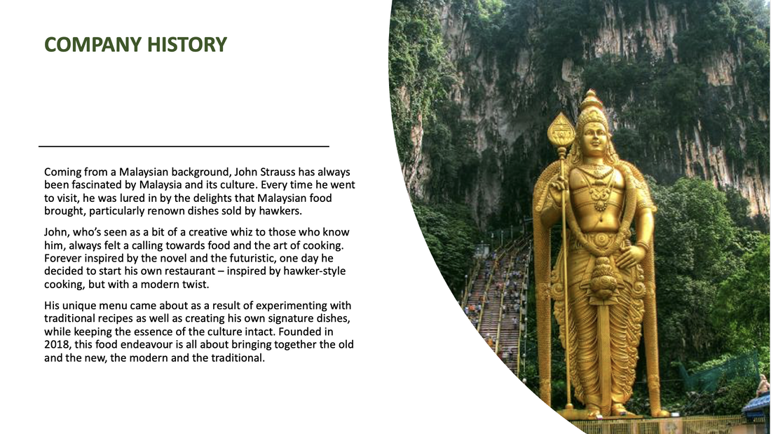
The challengeMy client is passionate about cooking and wanted to bring his idea of a Malaysian restaurant to life, inspired by traditional food sold by hawkers (street sellers). He values creativity and authenticity, and wants his restaurant to be a blend of the old and the new, the traditional and the modern.
The challenge was to create a visual identity that ties in with his core values and Malaysian traditions, while also appealing to a broader, multicultural crowd in Melbourne. |
|
Defining the brand
I created a mindmap to get a general feel for the restaurant and brand. I then outlined the brand story as I understood it, with feedback from my client. Together we defined the values, voice, vision, mission and history.

|
NAMES
|
VALUES
|
VOICE
|
VISION
To bring the best of tradition and novelty together into the Malaysian cuisine.
MISSION
Mohawk's vision is to give people authentic, hawker-style Malaysian food that anyone can enjoy, from traditional Malaysians to those new to the cuisine. Mohawk will provide a mix of classics, original creations and fusion, made with high quality, sustainably sourced ingredients.
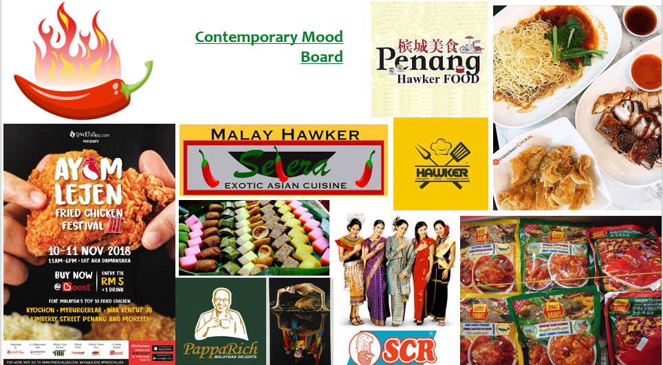
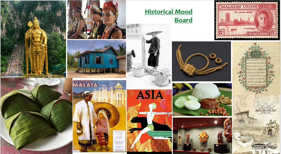
Visual inspiration - Mood boards
I started to look for visual imagery that tied in to my mindmap and the themes and values picked. I looked at Malaysian culture, food, branding of similar restaurants, etc. from both historical and contemporary perspectives. This would ensure I took inspiration from a range of time periods, particularly as the brand is about bringing together the old and the new.
|
|
The moodboards gave me a feel for the overall theme and color scheme. I started to experiment with colour and typefaces, and used them to develop a logotype and logo mark.
Logotype Development
LOGO TYPEFACE
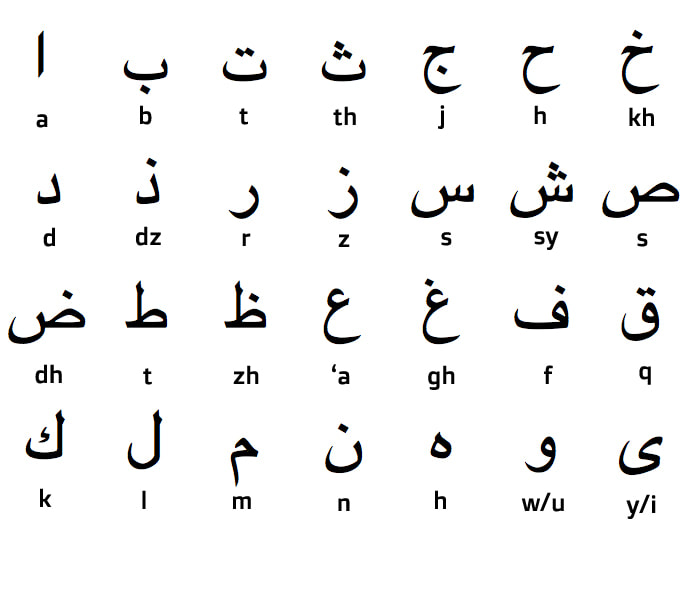
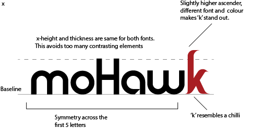
I wanted to pick a typeface that looks clean and modern, but that has an authentic touch to it. It should be exotic and personal, invoking a feel of Malaysian culture. My main influence was the Malay script and its older versions, as Malay is the official language spoken by 80% of Malaysian residents. 'Rounder' fonts achieve this as they imitate the style of the Malay script.
I wanted to pick a typeface that looks clean and modern, but that has an authentic touch to it. It should be exotic and personal, invoking a feel of Malaysian culture. My main influence was the Malay script and its older versions, as Malay is the official language spoken by 80% of Malaysian residents. 'Rounder' fonts achieve this as they imitate the style of the Malay script.
|
|
The Malay script has a lot of curves which gives it a rounded look. I wanted the font choices for the logotype to reflect this.
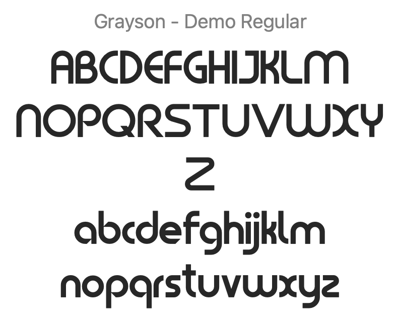
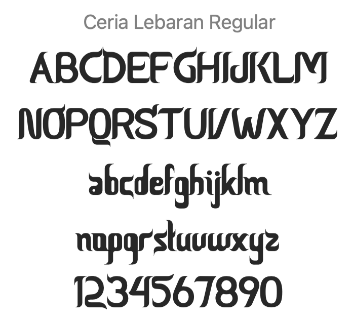
TYPE EXPLORATION AND SKELETONS

After some type exploration, I settled on the font pair below to create a logotype.
|
|
|
|
Final Logotype (in black)

Logo Colours
The mood board shows that certain colours are commonly used in Malaysian culture. I wanted to emphasise the ones that fit with moHawk's values. At this stage, I finalised the two complementary colours that will potentially be used in the final logo.
Denotes spice, hot chilli, flavour, vibrance, boldness, creativity and authenticity.
|
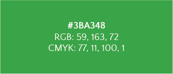
Denotes banana leaf (linked to tradition), growth and freshness.
|
Logo Development
Final Logo
Refining the shape of the banana leaf and adding a caption, I arrived at the final logo.
The play on the name mo-hawk and the leaf resembling the shape of a mohawk hairstyle is playful and creative, tying with the brand's values.
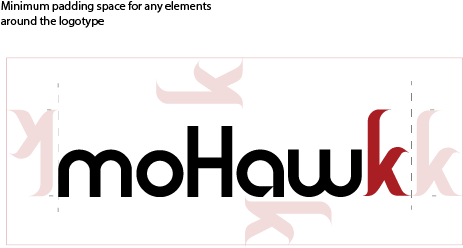
LOGOTYPE
To be used on the website and for brand assets with limited space, where the full logo won't fit.
To be used on the website and for brand assets with limited space, where the full logo won't fit.
|
|
FULL LOGO (without caption)
To be used for the restaurant sign and for any 3D brand assets.
To be used for the restaurant sign and for any 3D brand assets.
FULL LOGO (with caption)
To be used for any 2D brand assets.
To be used for any 2D brand assets.
|
|
|
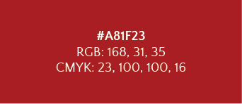
Brand Colour Palette
I added dark yellow as a primary colour (signifying brightness/joy, warmth and culture) and completed the colour palette.
|
PRIMARY |
SUPPORTING |
TEXT |
|
#A81F23 RGB: 169, 0, 0 CMYK: 0, 100, 100, 34 |
|
|
Brand Typefaces
For text, the font family chosen is Humanist typefaces. This is to convey the authenticity and uniqueness of Mohawk's home-cooked food.
|
For titles on web and other assets:
Alegreya aligns with Mohawk's values - being creative, unique/authentic and bringing the old and new together. These descriptions from Typographica describe Mohawk's approach to cooking:
"Alegreya successfully balances some risky stylistic choices with solid technique, resulting in a delightful mixture of the classic and the playful." "Asymmetric tilted serifs, richly varied color, exuberant details like curved tails on ‘u’ and ‘d’, and the sharp joints in the italics have the potential to become distracting. But each of these is carefully modulated and mixed into the overall texture. Like strong ingredients in a recipe, these elements marry in a subtle blend of the vivacious and the serene." |
Body text:

Open Sans is a humanist font "designed with an upright stress, open forms and a neutral, yet friendly appearance. It was optimized for print, web, and mobile interfaces, and has excellent legibility characteristics in its letterforms." (Google fonts)
|

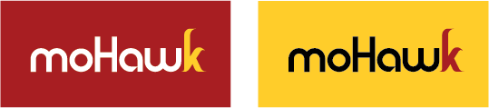
Logotype Colour Variations
Brand Applications
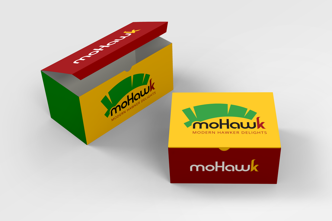
Delivery/ Takeaway box
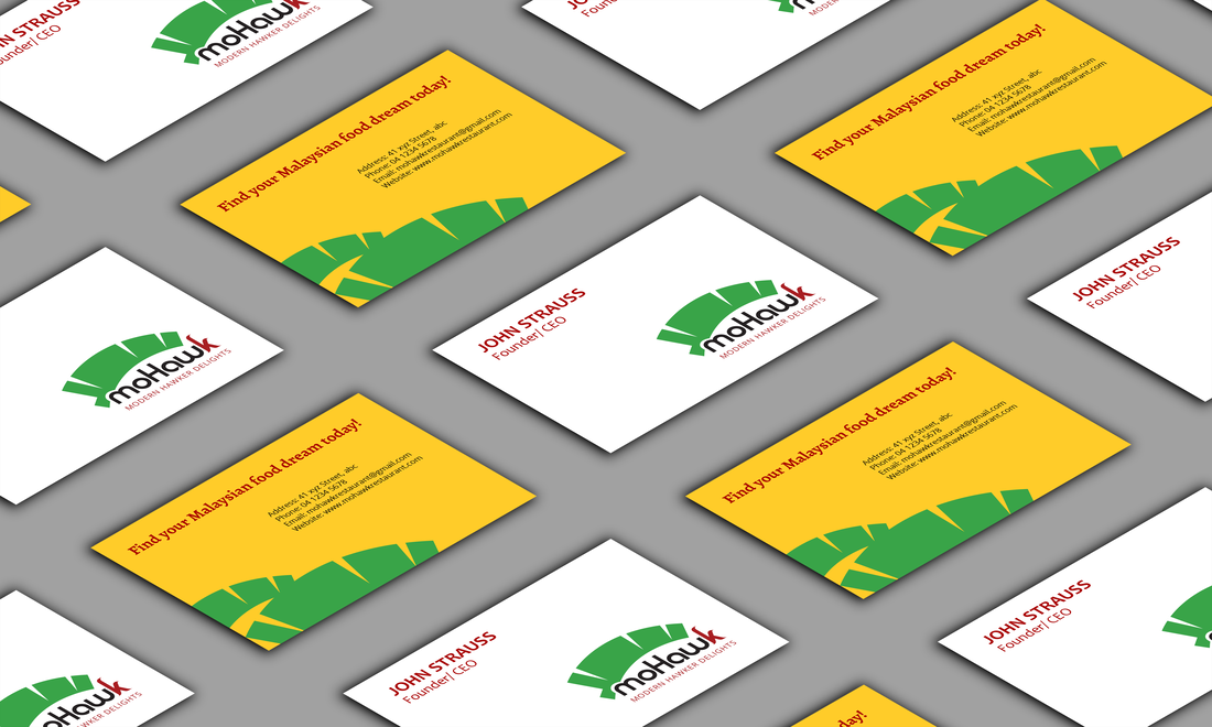
Business Card
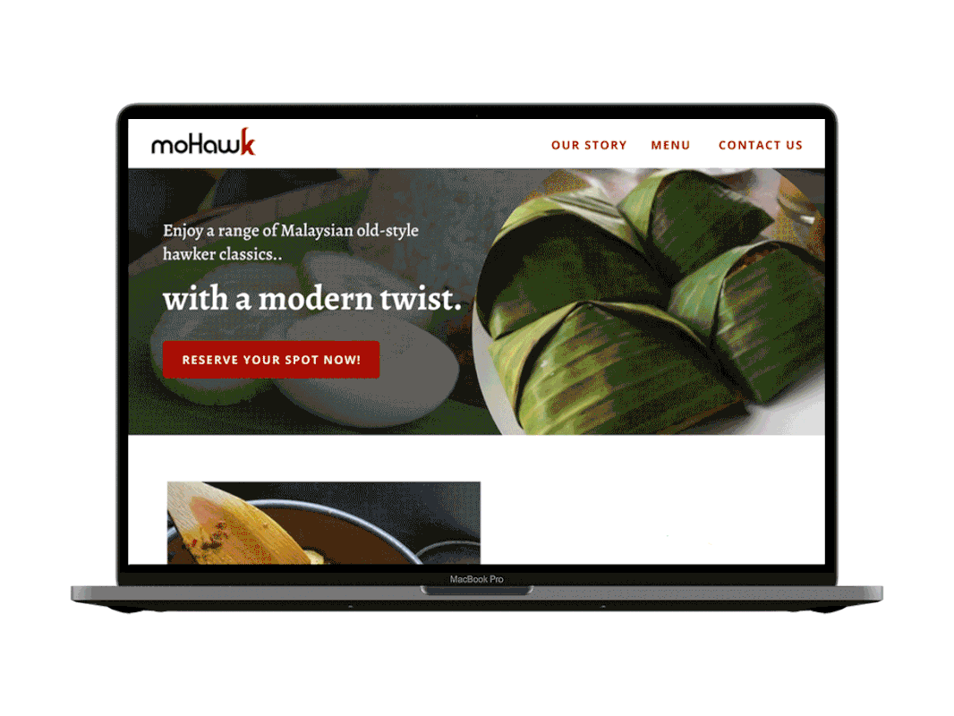
Website prototype (low res)
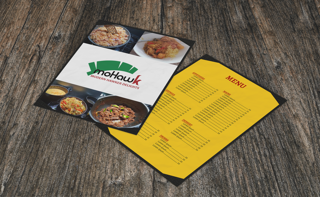
Menu

|

Patterns using the "k"
|

|
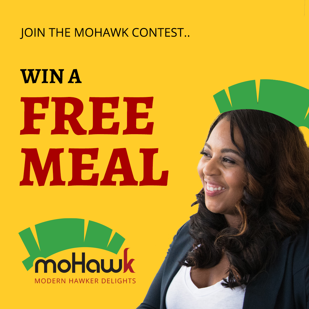
Promotion
Kickstarting any restaurant is a big deal, and we wanted to gear people up and excite them to start coming into the restaurant. At the same time, we wanted to set the tone with Mohawk's values. This promotion idea answered both.
|
Wondering what our secret ingredient is? Creativity! So here’s a contest in the spirit of that.
We want people to design the best food mohawk (yes, the hairstyle). References and inspiration are on the right, including our iconic banana leaf. Open to all kids and adults, people can draw, paint, build, craft, even photograph themselves wearing a mohawk made of food. The sky is the limit! This contest will run every 3 months, and the winner will get a free meal at the restaurant. |